
Linear Regression
Let's learn about Linear Regression in this blog📑.

Linear Regression
Linear regression is a statistical method for modelling the connection between a scalar response and one or more explanatory factors. It has also known as dependent and independent variables. Simple linear regression is used when there is only one explanatory variable. Multiple linear regression is used when there is more than one. This phrase differs from multivariate linear regression, predicting several correlated dependent variables rather than a single scalar variable.
The connections in linear regression are represented using linear predictor functions, the unknown model parameters calculated from the data. These kinds of models are known as linear models. The conditional mean of the answer given the values of the explanatory variables (or predictors) is most typically believed to be an affine function of those values; less frequently, the conditional median or another quantile is employed. Like all other types of regression analysis, Linear regression concentrates on the conditional probability distribution of the answer given the predictor values, rather than the joint probability distribution of all of these variables, which is the realm of multivariate analysis.
Linear regression was the first form of regression analysis to be carefully investigated and widely employed in practical applications. This is because models that are linearly connected to their unknown parameters are easier to fit than non-linearly related models, and the statistical features of the resulting estimators are easier to determine.
Categories
Linear regression offers a wide range of applications. The majority of applications fall into one of two general categories:
If prediction, forecasting, or error reduction are the goals, linear regression can be used to fit a predictive model to an observed data set of response and explanatory variable values. If new values of the explanatory variables are obtained without an associated response value after creating such a model, the fitted model may be used to predict the response.
If the goal is to explain variation in the response variable that can be attributed to variation in the explanatory variables, linear regression analysis can be used to quantify the strength of the relationship between the response and the explanatory variables, specifically determining whether some explanatory variables may have no linear relationship with the response at all, or identifying which subsets of explanatory variables may contain redundant information.
Example
Predicting Breast Cancer
Use Jupyter Notebook.
import pandas as pd
import numpy as np
import matplotlib.pyplot as plt
import seaborn as sns
from sklearn.preprocessing import StandardScaler
import sklearn.linear_model as skl_lm
from sklearn import preprocessing
from sklearn import neighbors
from sklearn.metrics import confusion_matrix, classification_report, precision_score
from sklearn.model_selection import train_test_split
import statsmodels.api as sm
import statsmodels.formula.api as smf
sns.set(style="whitegrid", color_codes=True, font_scale=1.3)

%matplotlib inline
df = pd.read_csv('BreastCancer_data.csv', index_col=0)
df.head()

df.info()
It looks like our data does not contain any missing values, except for our suspect column Unnamed: 32, which is full of missing values. Let's go ahead and remove this column entirely. After that, let's check for the data type of each column.
df = df.drop('Unnamed: 32', axis=1)
df.dtypes
Our response variable, diagnosis, is categorical and has two classes, 'B' (Benign) and 'M' (Malignant). All explanatory variables are numerical, so we can skip data type conversion.
Let's now take a closer look at our response variable, since it has main focus of our analysis. We begin by checking out the distribution of its classes.
plt.figure(figsize=(8, 4))
sns.countplot(df['diagnosis'], palette='RdBu')
benign, malignant = df['diagnosis'].value_counts()
print('Number of cells labeled Benign: ', benign)
print('Number of cells labeled Malignant : ', malignant)
print('')
print('% of cells labeled Benign', round(benign / len(df) * 100, 2), '%')
print('% of cells labeled Malignant', round(malignant / len(df) * 100, 2), '%')
Number of cells labelled Benign: 357
Number of cells labelled Malignant : 212
% of cells labelled Benign 62.74 %
% of cells labelled Malignant 37.26 %
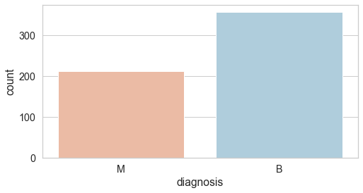
Out of the 569 observations, 357 (or 62.7%) have been labelled malignant, while the rest 212 (or 37.3%) have been labelled benign. Later when we develop a predictive model and test it on unseen data, we should expect to see a similar proportion of labels.
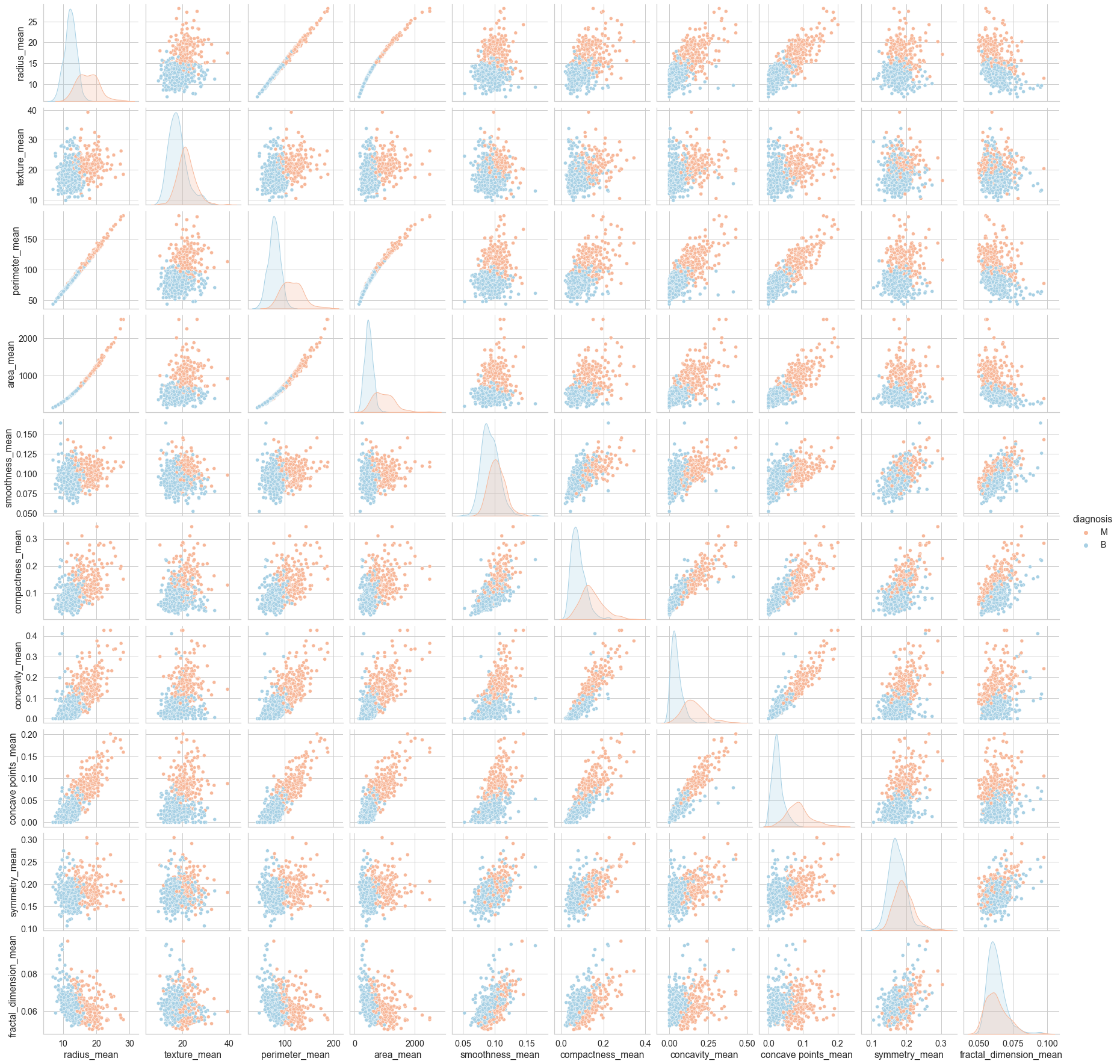
Although our dataset has 30 columns excluding the id and the diagnosis columns, they are all in fact very closely related since they all contain information on the same 10 key attributes but only differ in terms of their perspectives (i.e., the mean, standard errors, and the mean of the three largest values denoted as "worst").
In this sense, we could attempt to dig out some quick insights by analyzing the data in only one of the three perspectives. For instance, we could choose to check out the relationship between the 10 key attributes and the diagnosis variable by only choosing the "mean" columns.
cols = ['diagnosis',
        'radius_mean',
        'texture_mean',
        'perimeter_mean',
        'area_mean',
        'smoothness_mean',
        'compactness_mean',
        'concavity_mean',
        'concave points_mean',
        'symmetry_mean',
        'fractal_dimension_mean']

sns.pairplot(data=df[cols], hue='diagnosis', palette='RdBu')
corr = df.corr().round(2)
mask = np.zeros_like(corr, dtype=np.bool)
mask[np.triu_indices_from(mask)] = True
f, ax = plt.subplots(figsize=(20, 20))
cmap = sns.diverging_palette(220, 10, as_cmap=True)
sns.heatmap(corr, mask=mask, cmap=cmap, vmin=-1, vmax=1, center=0,
            square=True, linewidths=.5, cbar_kws={"shrink": .5}, annot=True)

plt.tight_layout()
cols = ['radius_worst',
        'texture_worst',
        'perimeter_worst',
        'area_worst',
        'smoothness_worst',
        'compactness_worst',
        'concavity_worst',
        'concave points_worst',
        'symmetry_worst',
        'fractal_dimension_worst']
df = df.drop(cols, axis=1)
cols = ['perimeter_mean',
        'perimeter_se',
        'area_mean',
        'area_se']
df = df.drop(cols, axis=1)
cols = ['concavity_mean',
        'concavity_se',
        'concave points_mean',
        'concave points_se']
df = df.drop(cols, axis=1)
df.columns


//Index(['diagnosis', 'radius_mean', 'texture_mean', 'smoothness_mean','compactness_mean', 'symmetry_mean', 'fractal_dimension_mean','radius_se', 'texture_se', 'smoothness_se', 'compactness_se','symmetry_se', 'fractal_dimension_se'],dtype='object')
corr = df.corr().round(2)
mask = np.zeros_like(corr, dtype=np.bool)
mask[np.triu_indices_from(mask)] = True

f, ax = plt.subplots(figsize=(20, 20))
sns.heatmap(corr, mask=mask, cmap=cmap, vmin=-1, vmax=1, center=0,
            square=True, linewidths=.5, cbar_kws={"shrink": .5}, annot=True)
plt.tight_layout()
X = df
y = df['diagnosis']

X_train, X_test, y_train, y_test = train_test_split(X, y, test_size=0.3, random_state=40)
cols = df.columns.drop('diagnosis')
formula = 'diagnosis ~ ' + ' + '.join(cols)
print(formula, '\n')
model = smf.glm(formula=formula, data=X_train, family=sm.families.Binomial())
logistic_fit = model.fit()

print(logistic_fit.summary())
We have successfully developed a logistic regression model. This model can take some unlabeled data and effectively assign each observation a probability ranging from 0 to 1. This is the key feature of a logistic regression model. However, for us to evaluate whether the predictions are accurate, the predictions must be encoded so that each instance can be compared directly with the labels in the test data. In other words, instead of numbers between 0 or 1, the predictions should show "M" or "B", denoting malignant and benign respectively. In our model, a probability of 1 corresponds to the "Benign" class, whereas a probability of 0 corresponds to the "Malignant" class. Therefore, we can apply a threshold value of 0.5 to our predictions, assigning all values closer to 0 a label of "M" and assigning all values closer to 1 a label of "B".
predictions = logistic_fit.predict(X_test)
predictions[1:6]
predictions_nominal = [ "M" if x < 0.5 else "B" for x in predictions]
predictions_nominal[1:6]
print(classification_report(y_test, predictions_nominal, digits=3))

cfm = confusion_matrix(y_test, predictions_nominal)

true_negative = cfm[0][0]
false_positive = cfm[0][1]
false_negative = cfm[1][0]
true_positive = cfm[1][1]

print('Confusion Matrix: \n', cfm, '\n')

print('True Negative:', true_negative)
print('False Positive:', false_positive)
print('False Negative:', false_negative)
print('True Positive:', true_positive)
print('Correct Predictions',
      round((true_negative + true_positive) / len(predictions_nominal) * 100, 1), '%')
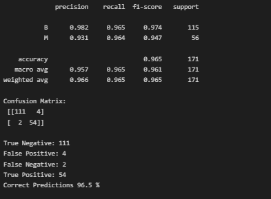
Our model has accurately labelled 96.5% of the test data. Then we will learn some topics in the upcoming blog. until Connect with me and share it with your friends and colleagues!....💖.